So I went to fill up my Presto card, which is the rechargeable pass being rolled out to access Ottawa’s public transit system. The back of the card instructed me to go to prestocard.ca.
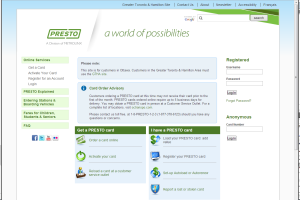
Once at the website, I was greeted with what’s pictured below. There was a spot to register your card, which I tried. However, the error message told me that the card and activation number on the card didn’t match their records. Odd. So then I tried to fill it up anonymously, but then was informed that mine wasn’t a valid PRESTO card number.

I assumed that it was a problem on their end. I ended up charging up the card in-person.
The next month, I noticed that there was an identical website that I was supposed to use. That all Ottawa riders are supposed to use. It’s not at prestocard.ca or www.prestocard.ca, but www2.prestocard.ca. Everything about it was otherwise the same. The main site was only for Toronto’s PRESTO system, irrespective of the municipality you were from.

This is exactly how you don’t want to design a website. If the card for Ottawa riders says to go to a website to fill up, and that website says that you can enter your card number here to fill up, you should be able to do just that.
If they want one website to serve both municipalities, then there should be a splash page or a clear indication for residents of each where to go. Since it’s the same system, the error I got should then have reflected the possibility of my using the site for the wrong locale. Better yet, there should have just been one website for everyone.
It also looks like they added the text “Ottawa Site” at the top of the main page too when you get there, which means you aren’t on the site for Ottawa.
This is definitively a design fail.